 -
- 


SnTT: Gantt Chart - Take 3
 Bookmark :
It's a little early in the week for a SnTT post but I got inspired by Chris Blatnick and Theo Heselmans who recently blog about creating Gantt Charts and so decided to share with you how I do it.
My approach is similar to Theo's only a little easier, it involves using 'Show as Icon' columns but instead of having to create several graphics I only have one and repeat it a number of times according to the values.
Here's what it looks like, and the formula is below:
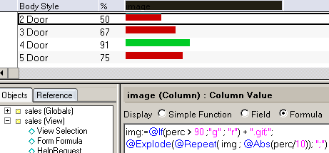
In the example I use a green graphic for percentages above 90 and a red for numbers below that.
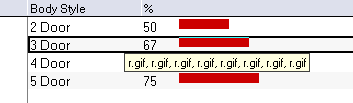
If you're still reading, I have to let you know there is one drawback in this solution. If you mouse over one of the graphics you will see something like the image below. Not very pretty.
I will be experimenting with Chris's solution.

